Corporate Identity System: Children’s Counseling Services


Project Overview
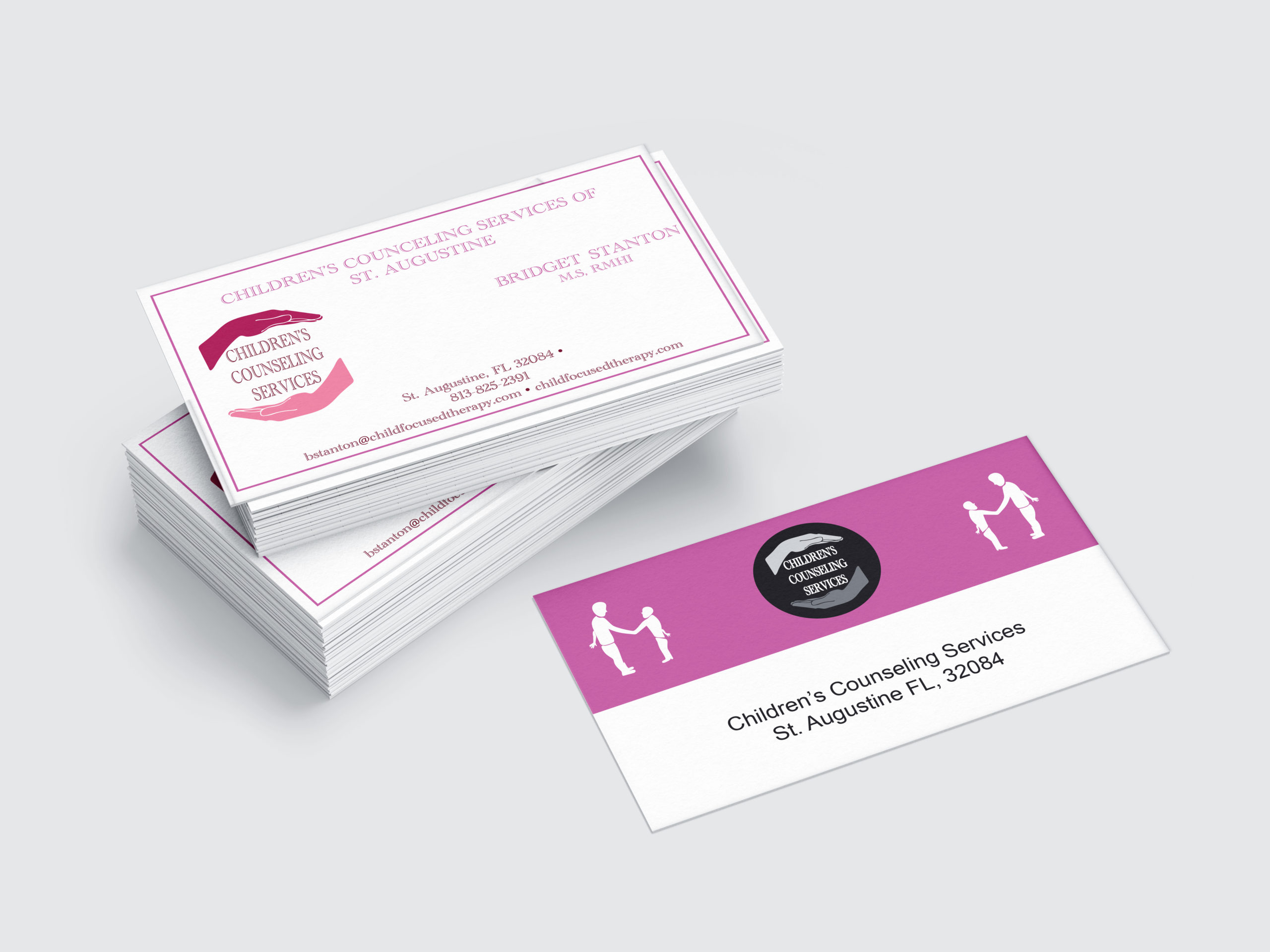
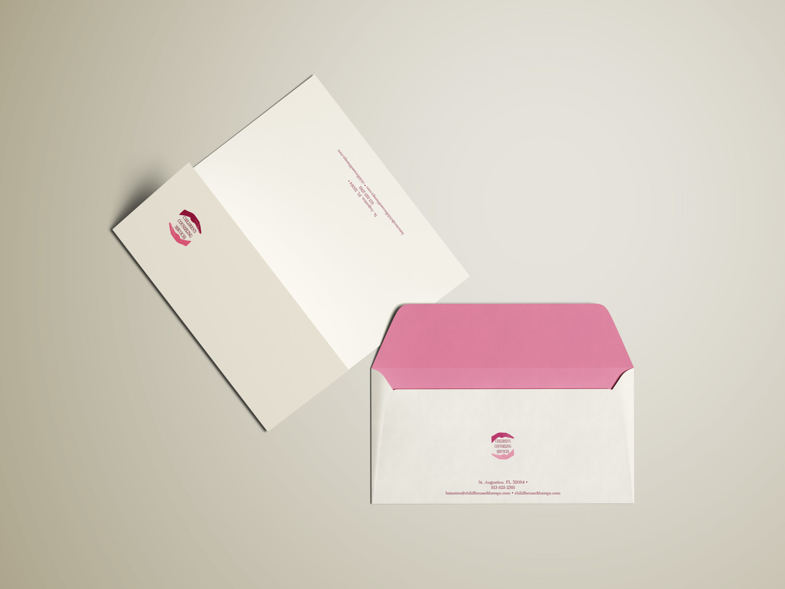
This comprehensive branding initiative focuses on the establishment of a private psychotherapy practice for Bridget Stanton, MS. The core objective was to engineer a cohesive corporate identity system and visual package for Children’s Counseling Services. This deployment encompassed the development of a professional brand logo, a standardized business stationery package, and an informational print collateral system detailing the firm’s clinical philosophy, specialized family services, and client outreach offerings.
Brand Architecture & Symbolism
The design architecture targets a maternal, supportive, and secure aesthetic to foster an immediate bridge of trust between the clinician and families.
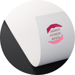
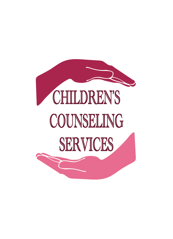
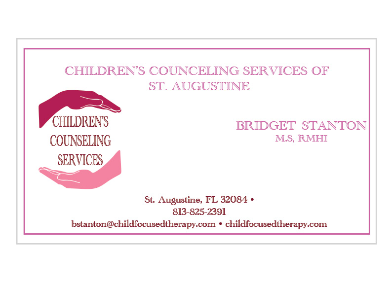
- Logo Architecture: The core mark features two vertically mirrored hands encasing the clean typographic brand name layout. The contrasting color palette within the hands structurally communicates diversity, accessibility, and inclusivity across the clinical practice. The geometric alignment signifies an outreach of comprehensive support, anchoring the visual weight of the firm’s mission statement.
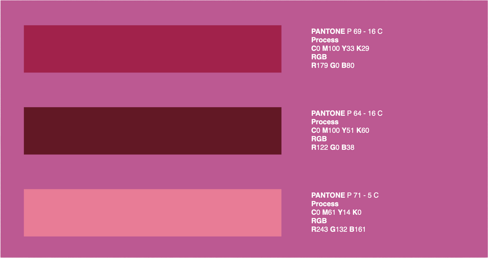
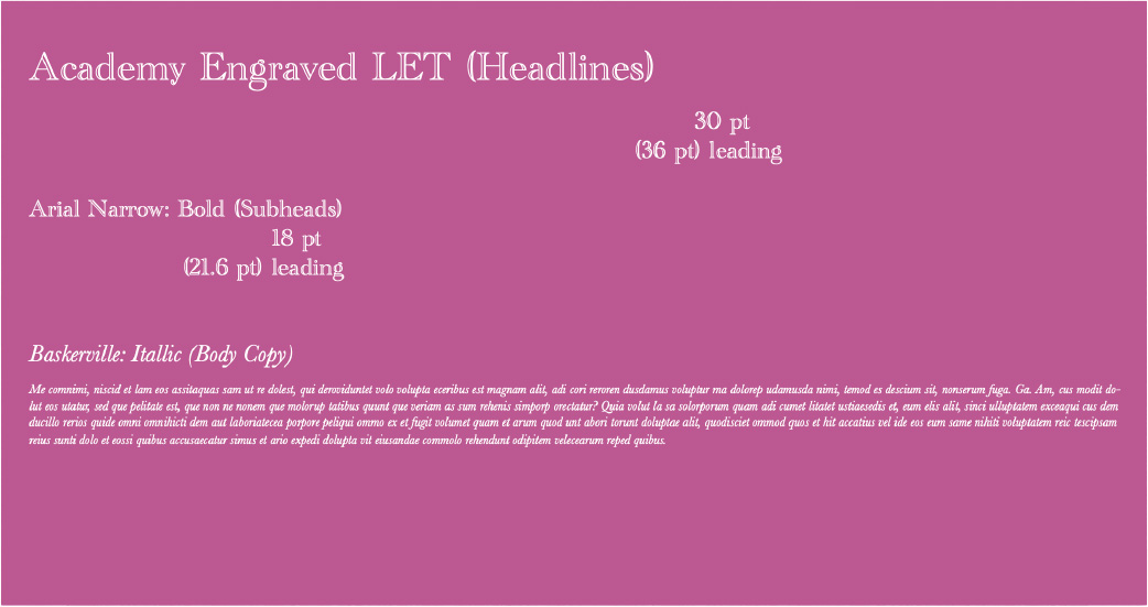
- Palette & Color Space: The corporate color profile utilizes a maternal spectrum of warm pinks and magentas. This deliberate selection establishes an empathetic, clinical atmosphere while reinforcing professional authority.
Print Collateral & Asset Deployment
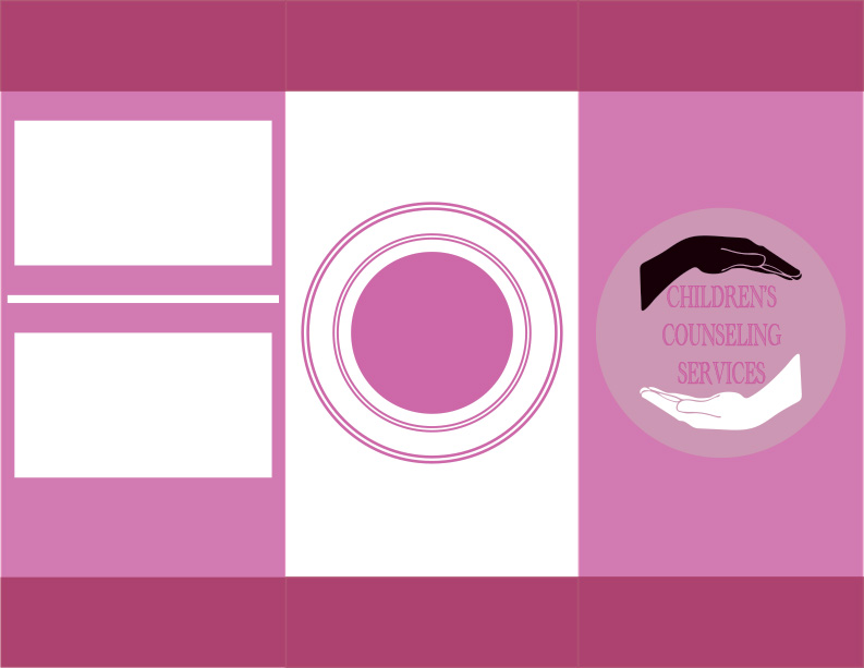
To communicate the firm’s specialization in individual and family psychotherapy, a high-end trifold brochure system was executed. Adhering strictly to the practice’s brand guidelines, the publication layout prioritizes clear information hierarchy across its panels. This ensures that essential data regarding patient intake procedures, clinical services, and support networks is highly legible and intuitive for prospective clients.





View More Works Below!