Fashion Editorial & Campaign Layout: ZARA Seasonal Lookbook
Project Overview
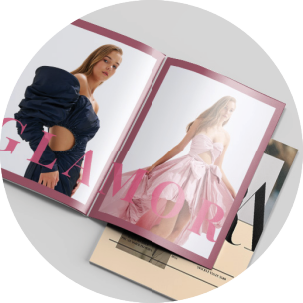
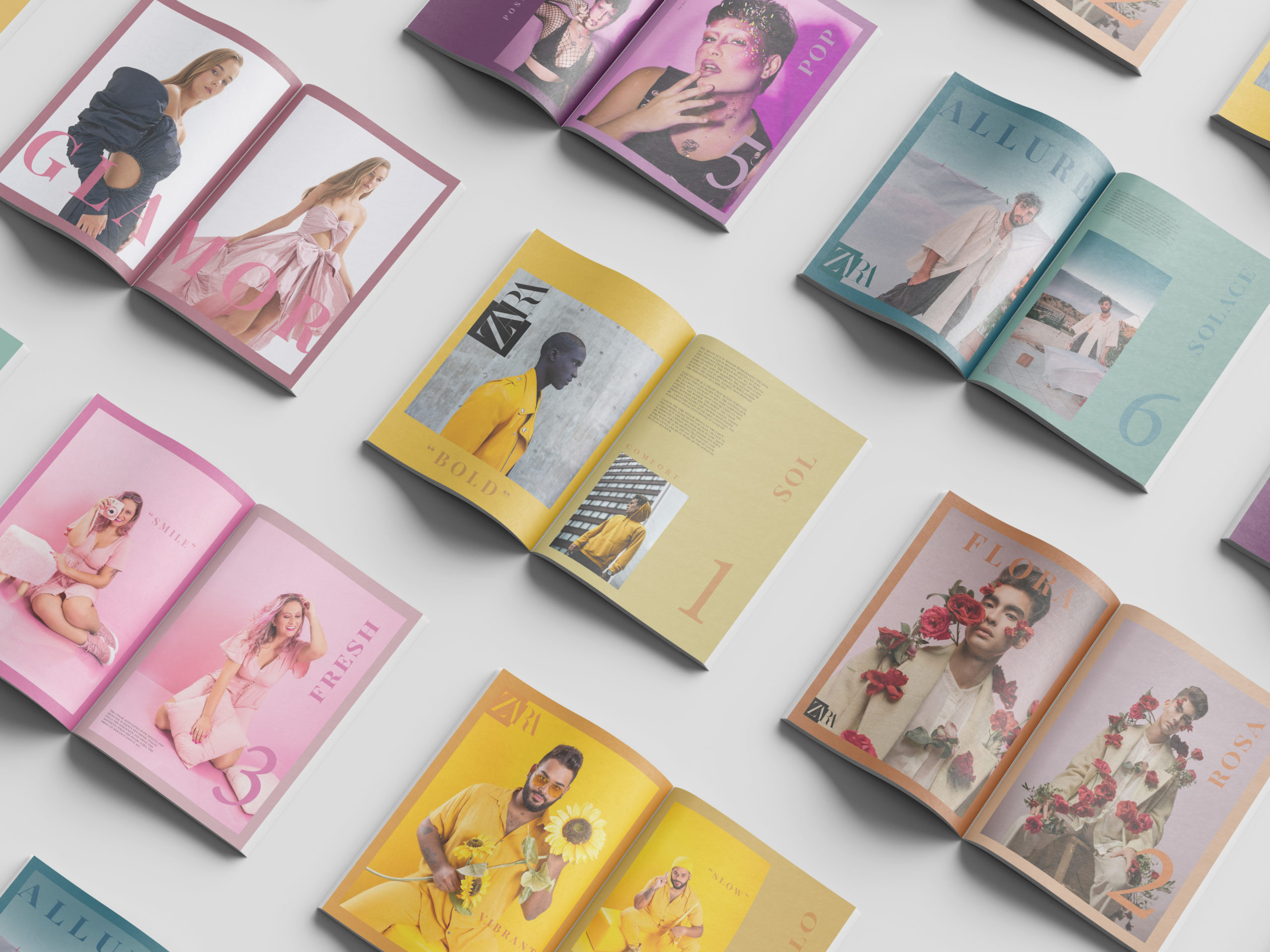
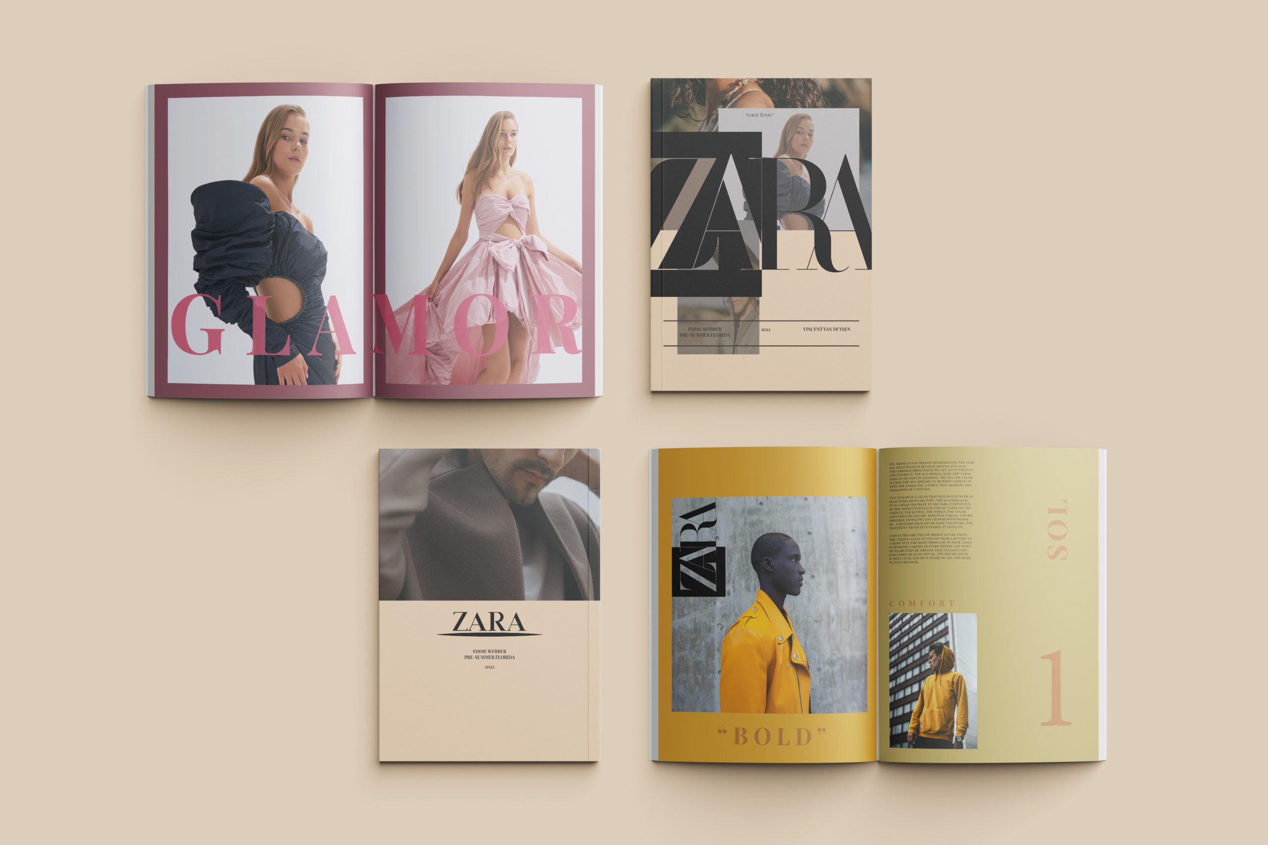
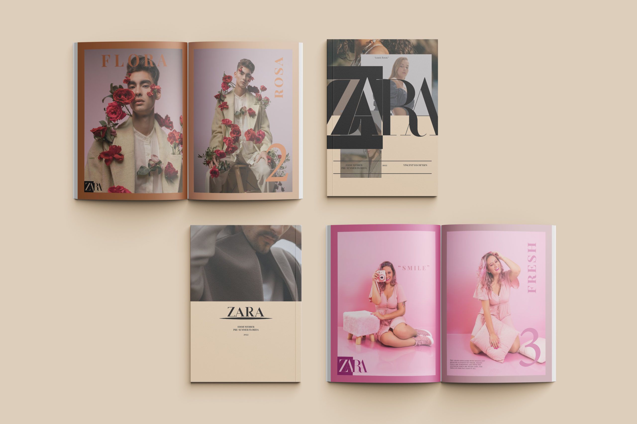
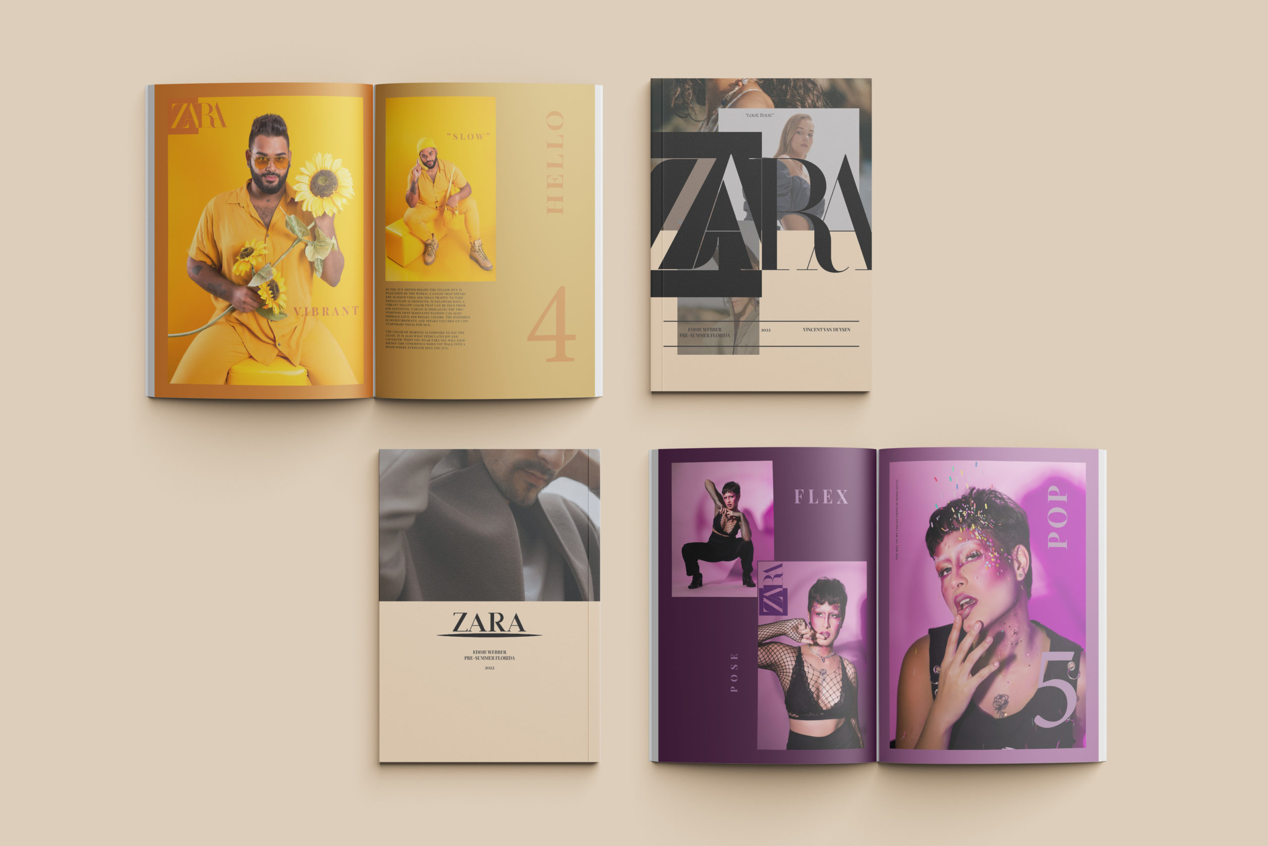
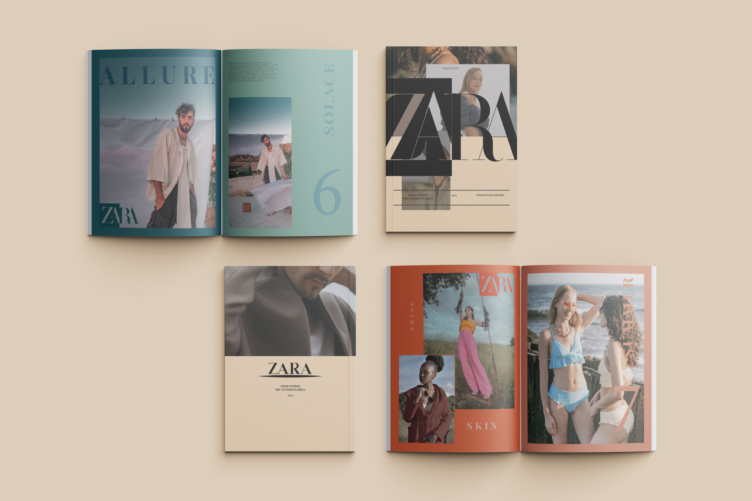
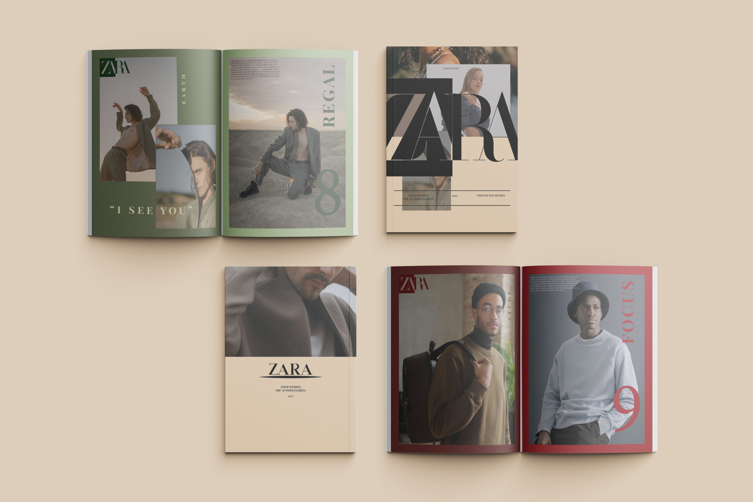
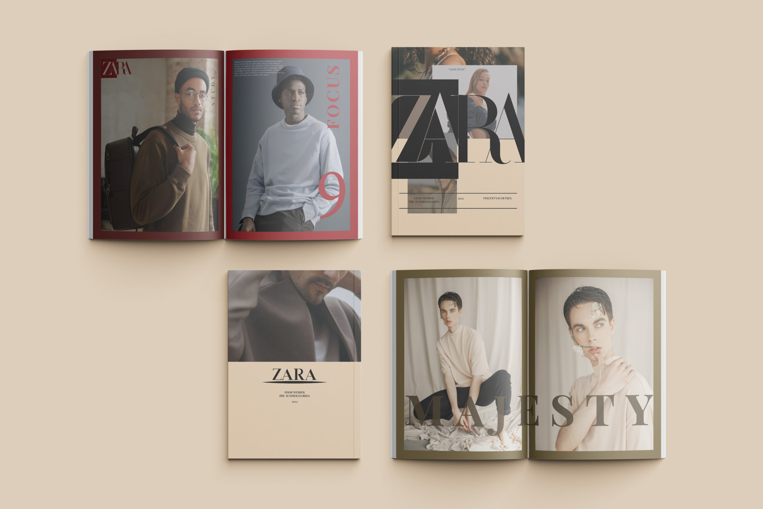
This high-end print design initiative focuses on the conceptualization, asset curation, and grid engineering of a seasonal publication lookbook for the global apparel brand ZARA. The primary objective was to construct an elite, multi-page layout system comprising front and back covers, two interior cover spreads, and nine specialized page layouts designed to showcase the brand’s pre-summer apparel line.
Design Strategy & Color Architecture
The core creative challenge lay in respecting ZARA’s established aesthetic while introducing a deliberate, strategic evolution into the visual narrative to optimize user engagement and commercial appeal.
- Brand Identity Adaptation: ZARA’s corporate signature is recognized for its rustic, minimalist casual wear styling utilizing an organic color palette of taupes, neutrals, and muted nude tones. To bridge this classic footprint with the vibrant energy of a summer deployment, a calculated injection of energetic accent tones was introduced, adding structural contrast while preserving the brand’s core heritage.
- Typographic & Spatial Layouts: Spreads were engineered using a multi-column modular grid to establish an authoritative hierarchy between high-fashion editorial photography, product metadata, and white space. The geometric arrangement ensures that each apparel ensemble functions as a distinct visual asset, translating raw product data into a luxury editorial experience.
Technical Execution
The entire multi-page spread architecture was developed within an advanced publishing pipeline, ensuring strict margin bounds, bleed tolerances, and color management systems are optimized for high-fidelity print or direct-to-digital PDF distribution.
View More Works Below!