Civic Brand Architecture & Unification: Community Redevelopment Agency
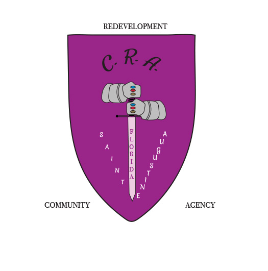
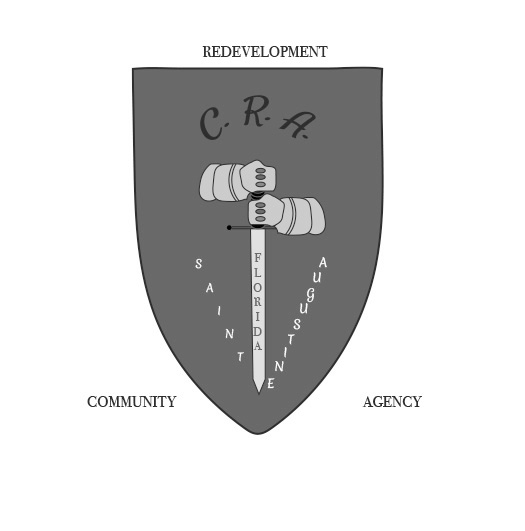
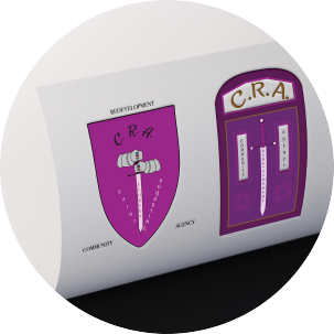
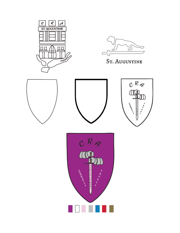
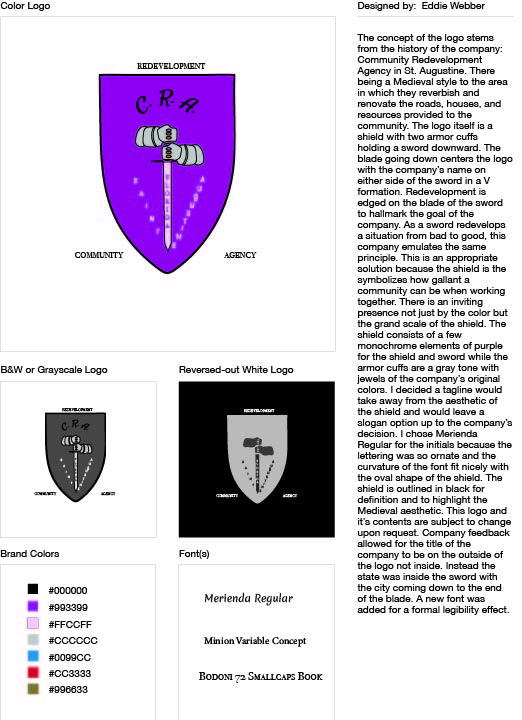
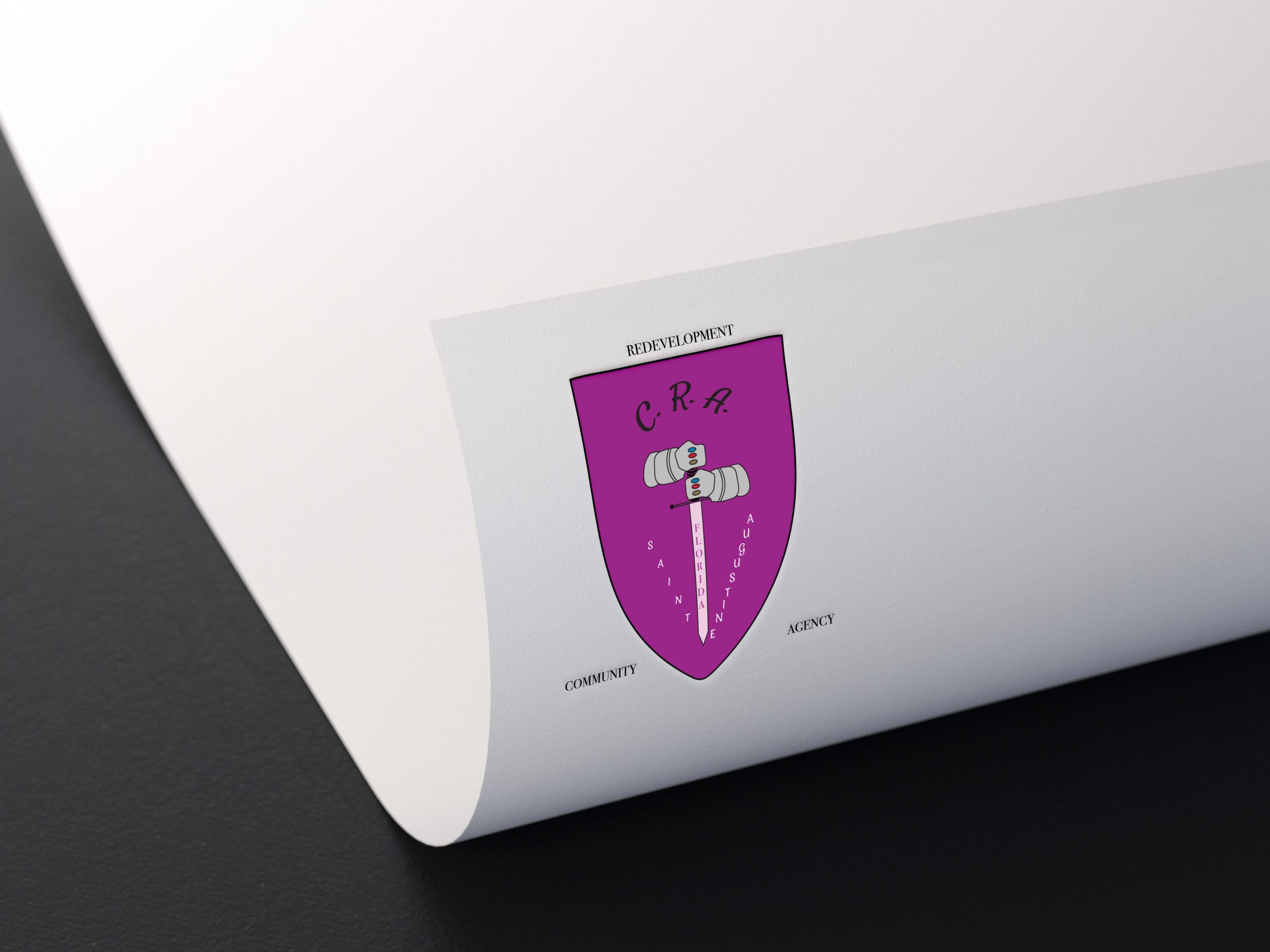
Community Redevelopment Agency (CRA) logo
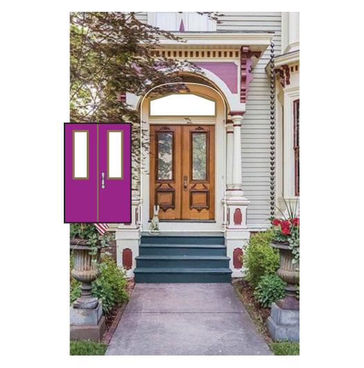
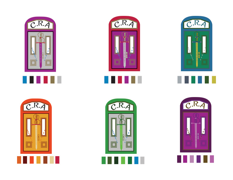
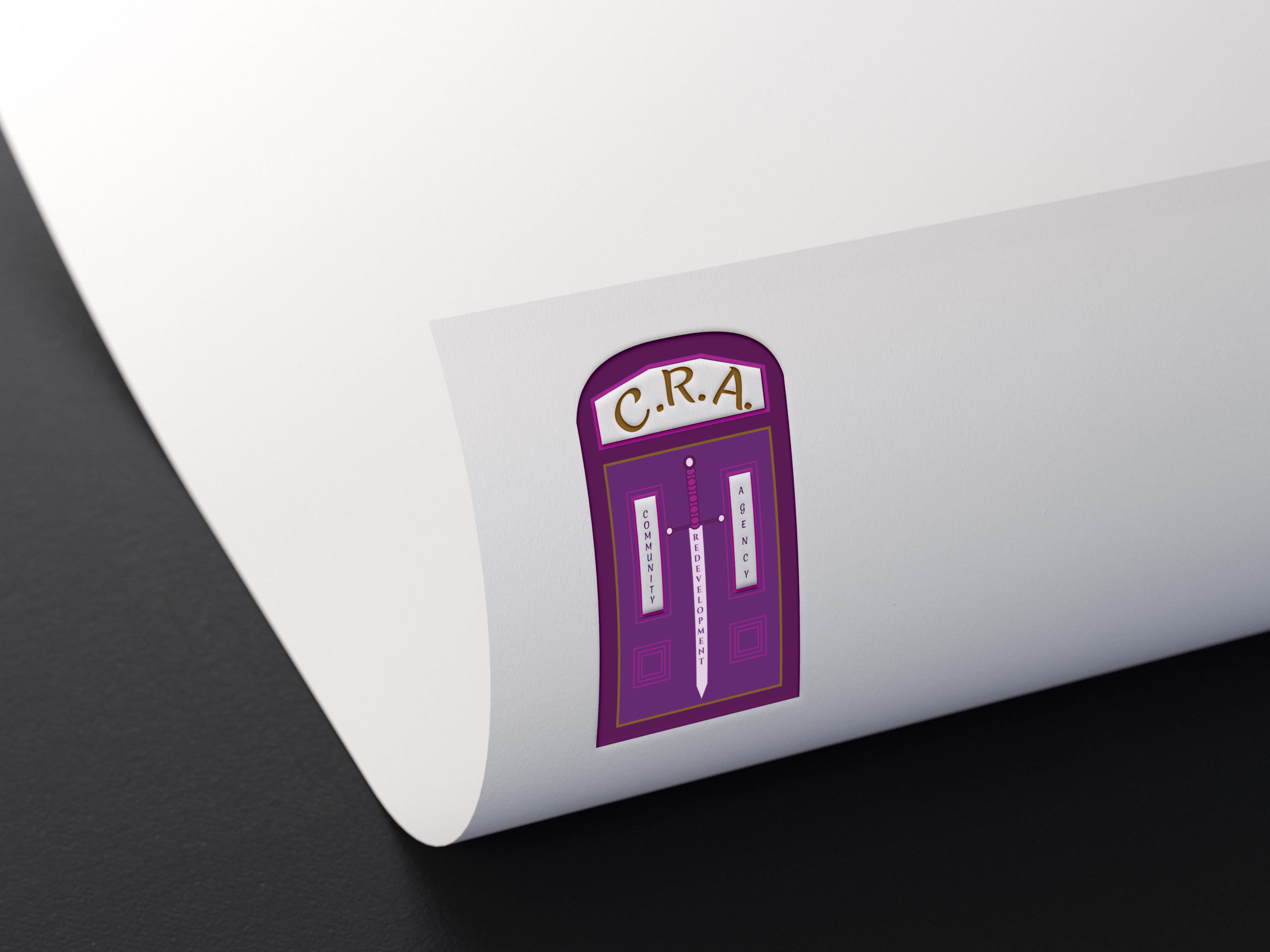
Lincolnville Community Redevelopment Agency (LCRA) logo
Project Overview
The Community Redevelopment Agency (CRA) of St. Augustine, alongside its joint regional branch, the Lincolnville Community Redevelopment Agency (LCRA), required a comprehensive visual rebranding to modernize their civic presence. Under the administrative direction of Jamie D. Perkins, the objective was to engineer a unified corporate identity system. This deployment encompassed a complete redesign of both agency logos and the development of high-impact print collateral detailing the organization’s municipal benefits, local initiatives, and public funding pipelines.
Brand Architecture & Symbolism
The core challenge was balancing the separate historical identities of the parent agency and its localized branch while maintaining a cohesive corporate affiliation.
- CRA Parent Identity: Engineered as an authoritative heraldic shield utilizing the agency’s signature purple corporate color space. The logo incorporates two iron gauntlets holding a central sword to anchor the visual weight. The design features a precise diagonal typographic layout reading “St. Augustine” meeting at the sword’s vertex, embedding regional heritage directly into the geometry. Three knuckle-set gemstones preserve the exact color palette history of the organization’s legacy mark.
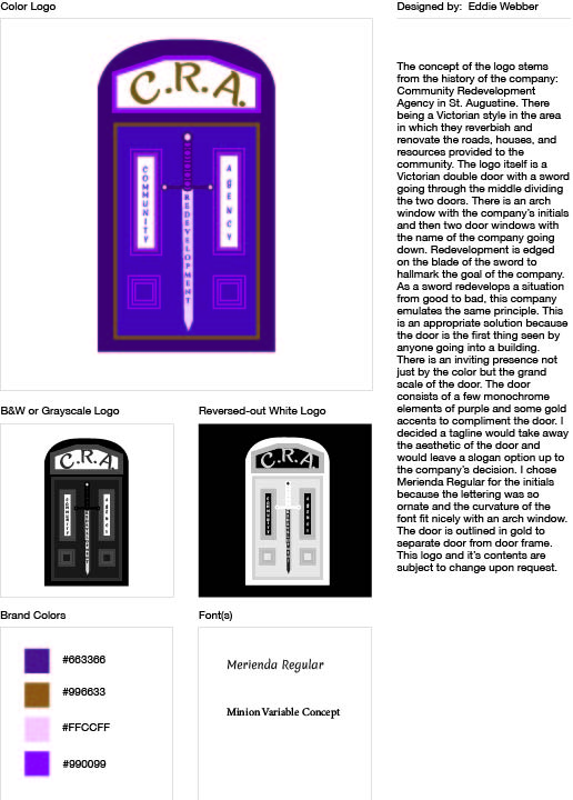
- LCRA Localized Extension: Developed to highlight the architectural identity of the Lincolnville sector, this mark utilizes a structural Victorian door framework. The agency initials are systematically arranged within the arched transom to create a functional stained-glass geometric layout, while the vertical window panels cleanly display the organization’s full name. The central alignment of the sword structurally binds the localized branch to the parent agency’s authority.
Print Collateral & Asset Deployment
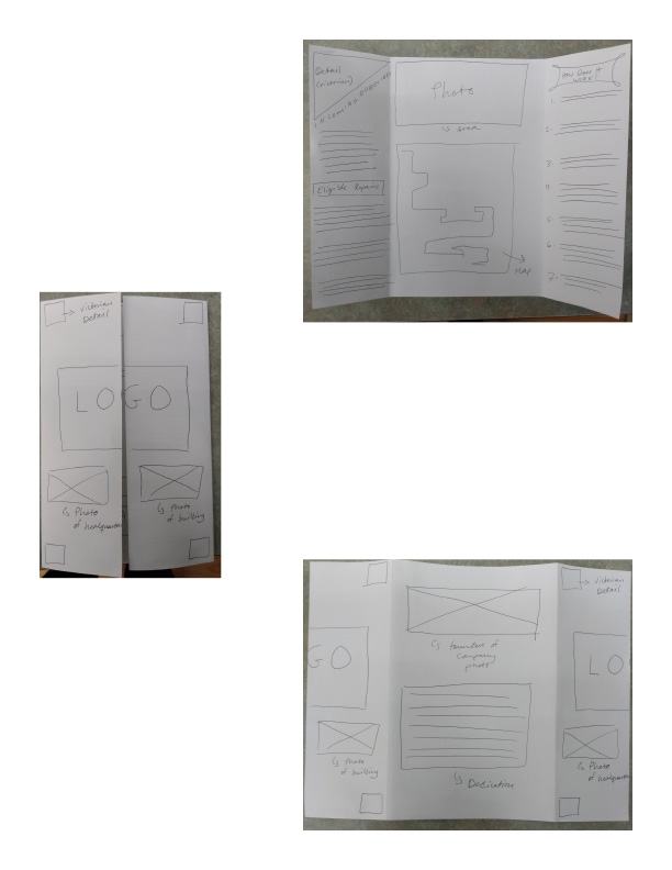
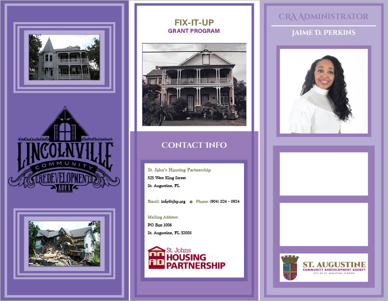
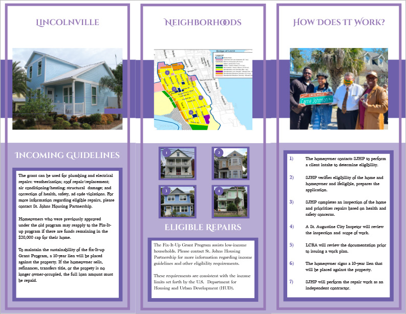
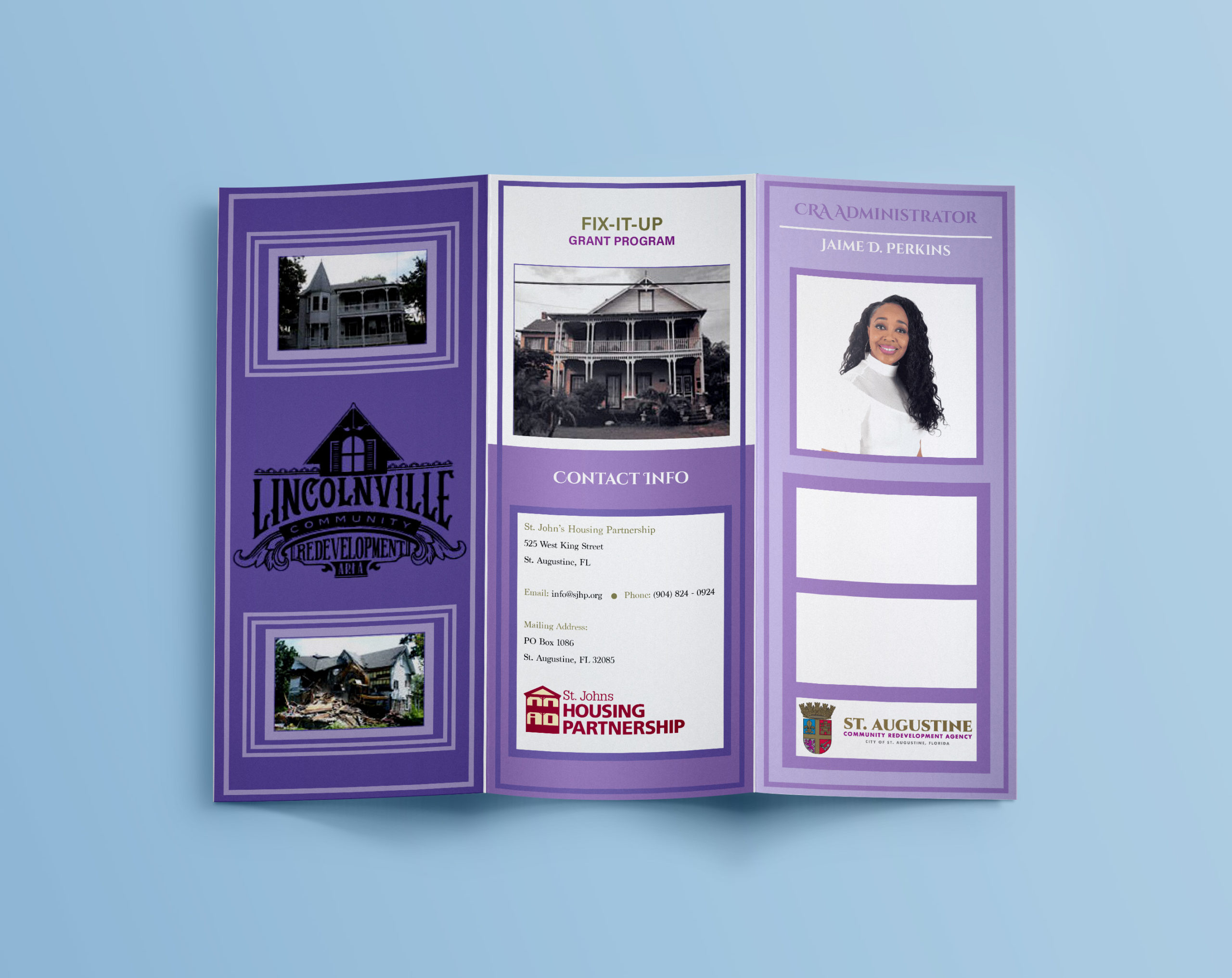
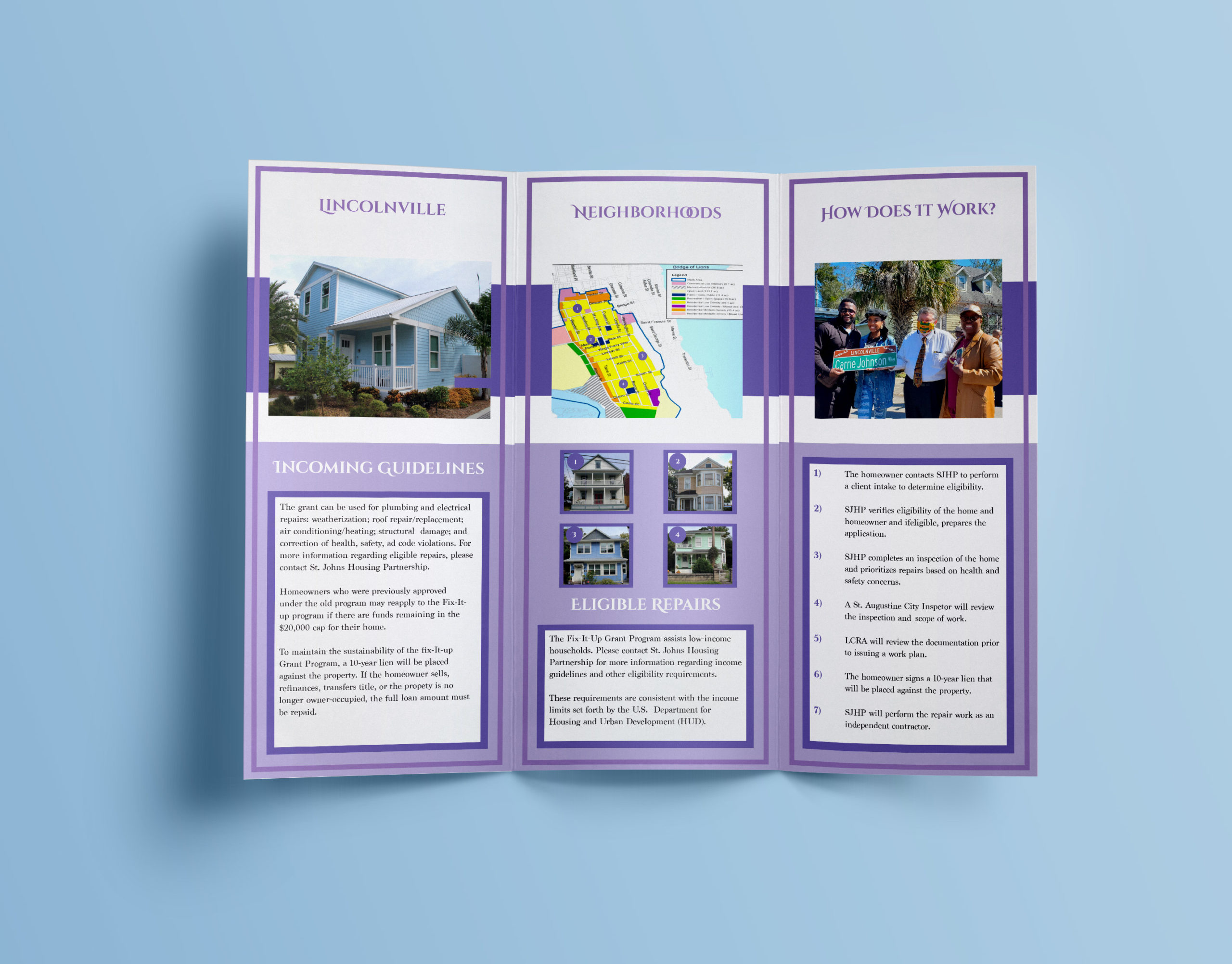
To communicate the agency’s development roadmap and public funding opportunities, a specialized editorial brochure system was executed. Leveraging premium typographic embellishments and the unified corporate color palette, the multi-page layout prioritizes strict information hierarchy. This ensures complex public-sector data, community advantages, and financial allocations are immediately accessible to local stakeholders and municipal investors.
View More Works Below!